Rebrand:
Taco Bell
When embarking on this rebrand the driving force was the companies logo history. Having the pleasure of creating this project with the unbelievably talented Adam Hoens (@_ndlocal), we found drawn to Taco Bell’s design direction of the past.
There was something soulful and warm about Taco Bell’s logos from 1972 - 1994 and agreed that it had lost something in its 2016 redesign. This was the reason for choosing this company to rebrand and decided we wanted to be inspired by the colors and feeling that the logo once gave us.
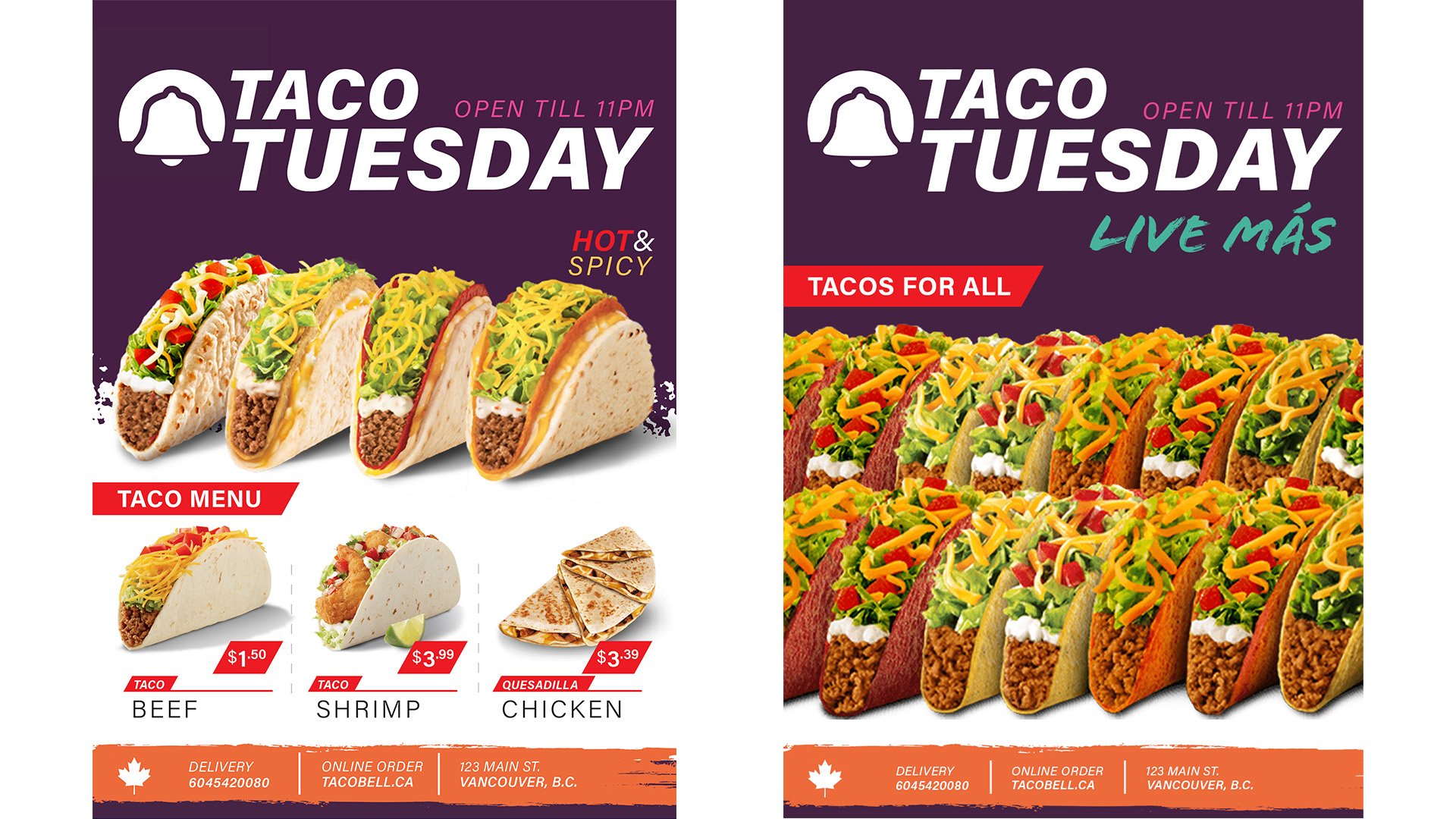
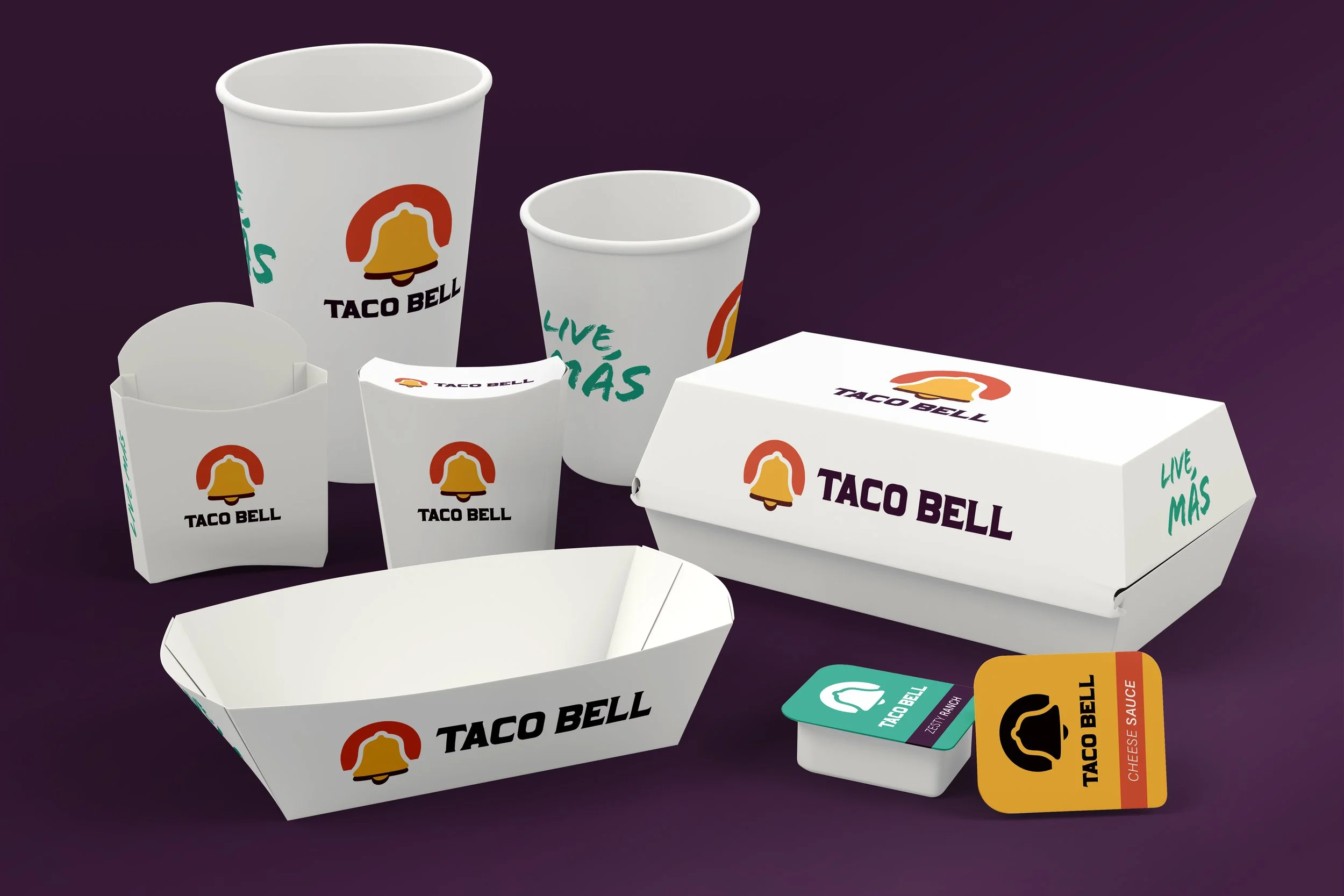
We started by bringing back the serif typeface and elevating the bell, along with adding the fading sunset around the bell. We updated their packaging and advertisements wanting to keep what is great about Taco Bell, while again bringing back the soul of what we felt had been lost.
It was discussed that the tagline be updated along with the logo but found that we loved not only the message but the typeface as well, as it works in beautiful contrast with our logo rebrand.


