Brand Design:
Prime
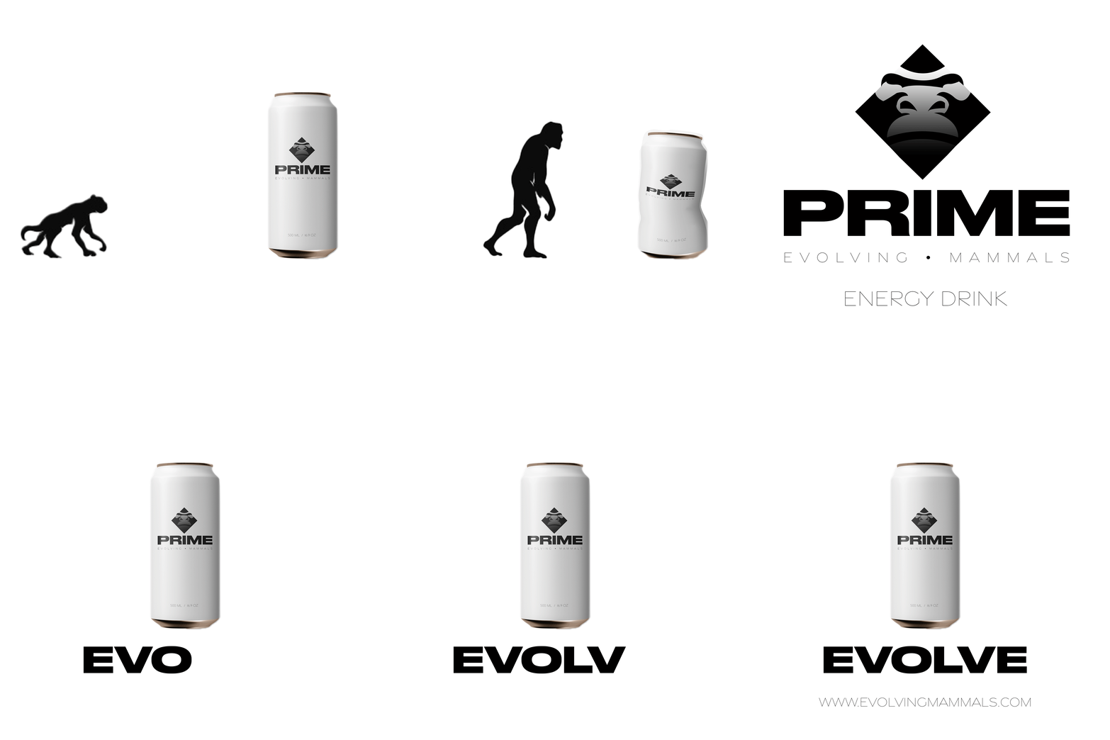
Evolving Mammals has officially created its first energy drink, ‘Prime’. The word ‘Prime’ comes from the sense of strength, vigour, success and greatness being at peak performance brings our customers. The energy drink assists on the journey of growth and development, made with the highest quality ingredients to ensure top-level performance.
The icon of the logo comes from the gorilla who represents all the pieces of what ‘Prime’ is to us; strength, intelligence, communication, dignity, tranquillity, gentleness, and family. The logo is subtle and strong inviting an upscale and professional audience that aligns and are fascinated with these values.
Prime by Evolving Mammals was developed to promote a line of healthy energy drinks. An icon to represent our evolution as humans and the word ‘prime’ to ensure that this brand’s products get the customers to prime performance.


The vision for the company expanded when I was asked to create a gif, really showing the company’s goal by physically growing as you drink and crushing the companies product.
Yet another expansion was made in the form of a mobile app. The login page is clean and bold, as well as elegant and strong, just like the brand’s products. I wanted this to be inviting and give the feeling that movement at peak performance can happen with the prime energy drink.
When creating Prime I wanted to build a brand that could be expanded. I see the company, Evolving Mammals, having the ability to produce many more products under the umbrella of healthy living. Offering a greens powder, protein powder, pre and post-workout powder all with the same feeling expressed here.