Brand Design:
RUH
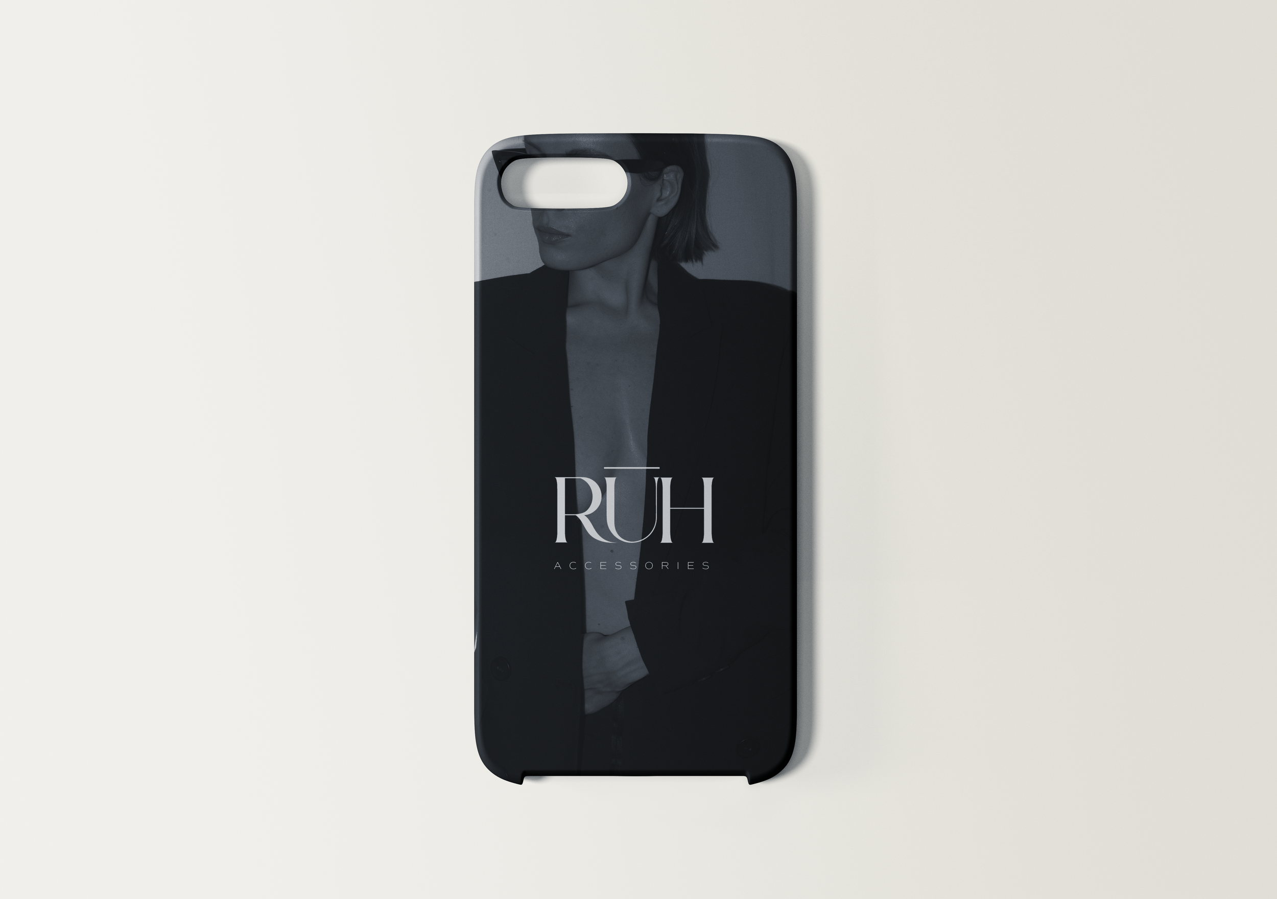
For the modern millennial women coming with a sense of class looking for timeless pieces, RUH offers everything accessories including sunglasses, earrings, bracelets, rings and necklaces. With a gentle understated offering, the soulful designs create luxury without the cost.
The colors chosen for the RUH palette are subtle and upscale, having a base of cream and black with a hint of taupe for professionalism. A light grey to bring the gentle side of the brand to the surface as well as the pop orange for a bold contrast.
RUH has a typographic logo using an elegant and modern serif typeface. Its bold and fine lines represent the design of RUH accessories. The logo is made to share the subtle yet strong attributes of professional intelligent women, representing the minimal and understated frosting that brings out the best in every woman.
I created a brand story when designing the logo and identity for RUH to bring the companies values and goals to life. Something to refer back to during the design process.


Brand Story:
When Emily was a little girl, her father would come back from working overseas always bringing her little trinkets. It wasn’t until she received her very first necklace with her name written in Arabic that she realized how close to her heart accessories were.
The feeling of Emily having her father’s love wrapped in a beautiful piece of gold that she could touch and look at every day meant that even though she could not see him, he always felt like he was there.
As their years of Emily’s father working away continued, she would build a collection of accessories from her father that would ground her in moments of uncertainty and then become the reason RUH was founded.
RUH is the Arabic word for soul, the named company was born. The accessories that brought so much light to Emily’s world are now made to bring light to everyone’s world.
“My soul is the light that grounds me.”
-Angie Welland-Grace