Brand & Packaging:
KESE
KESE is a hair care line designed for the modern millennial. Sleek and minimal the products are made not only to bring life back to your hair but to stand alone as art pieces in your bathroom.
The colors are bold, yet are muted. The typefaces are modern, yet timeless. The clear space shares a sense of calm, along with the relaxed feeling we have at the salon and have always wanted to bring home.
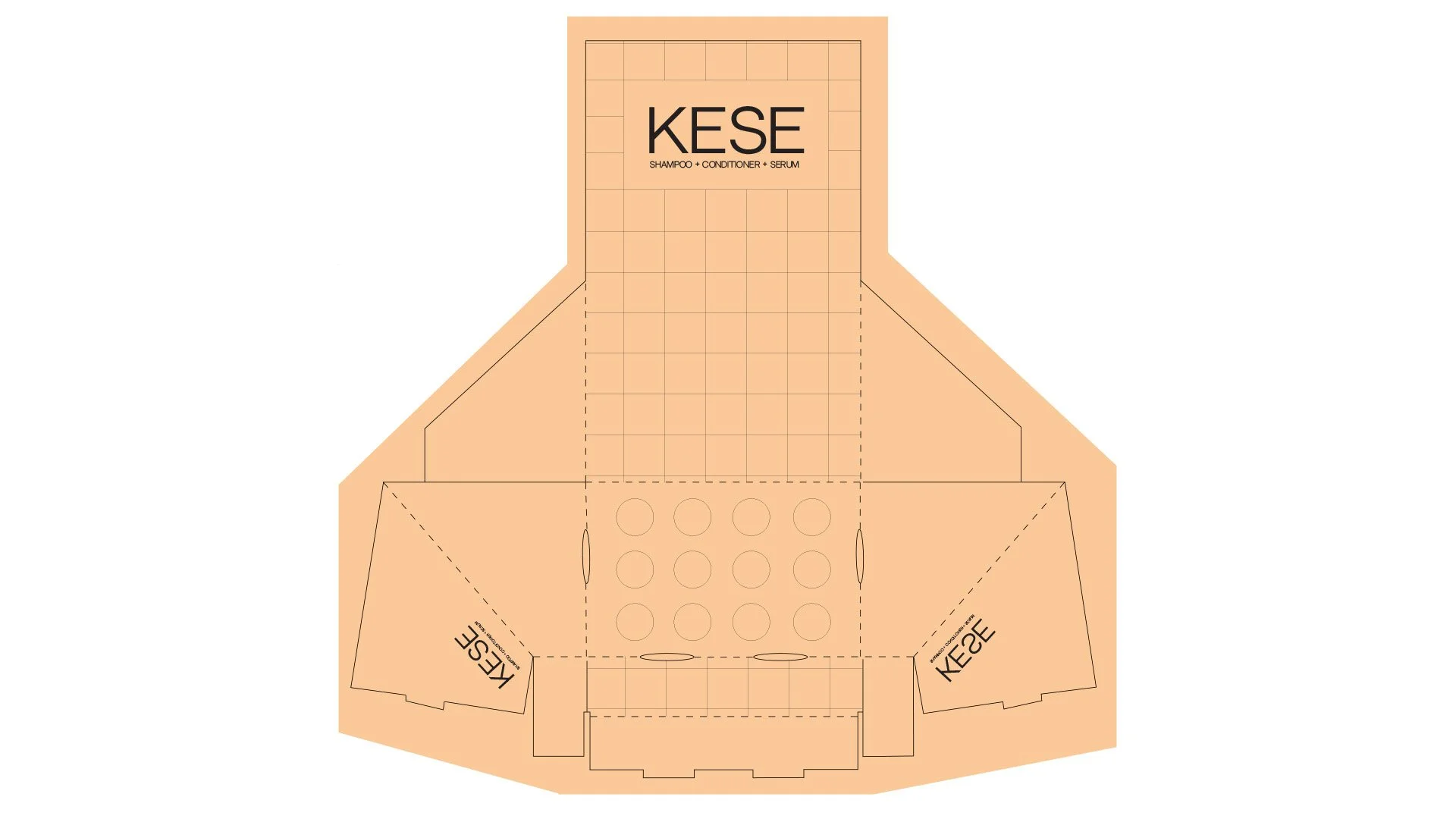
By bringing the salon home with you, I wanted the brand design and packaging of KESE to offer beauty in a bottle. My goal for customers at the cash register paying for their fresh new cut, see these products sitting in their bright box inspired by bathroom shower tiles to be absolutely unable to resist adding these to their purchase.
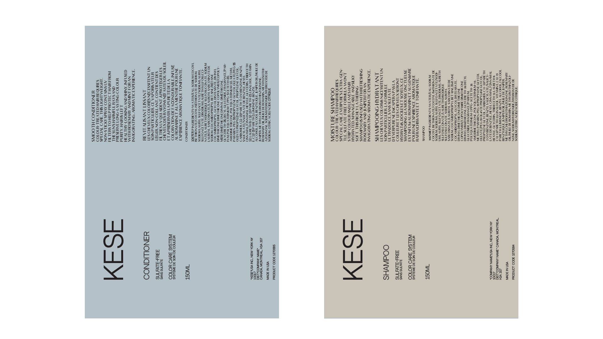
It was important to me that this product line logo be minimal, bold and upscale. When I look at what I want my bathroom products to look like, I want them to make me feel like a true goddess in the making. This was the direction I took. Offering the customer open space to guide their eye first to the logo name, then to what the product is, while giving them breathing room before reading everything required on each bottle; is what drove my design. The colors came from calming product lines that inspire me while driving the idea home with a box showing the texture of the product to give it that real upscale feel.


Among having great packaging, great counter presentation is key. The retail display I designed is made to go beside a cash register at a salon or a high end beauty store, and made to stand out. The color was chosen not only because of its vibrancy but because it goes very well with the colors of the products already designed. The pattern on the retail display was designed to look like the tiles in your bathroom, where these products will be home to.